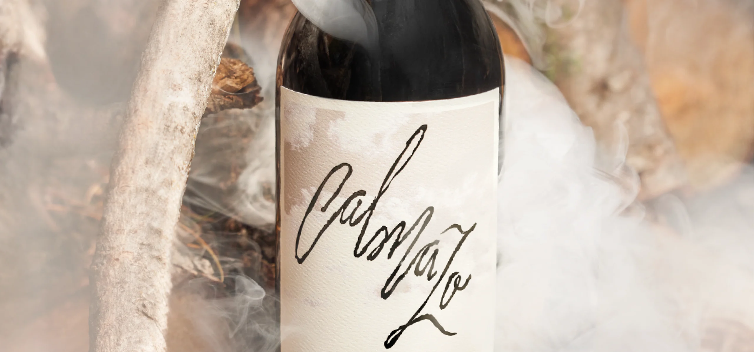
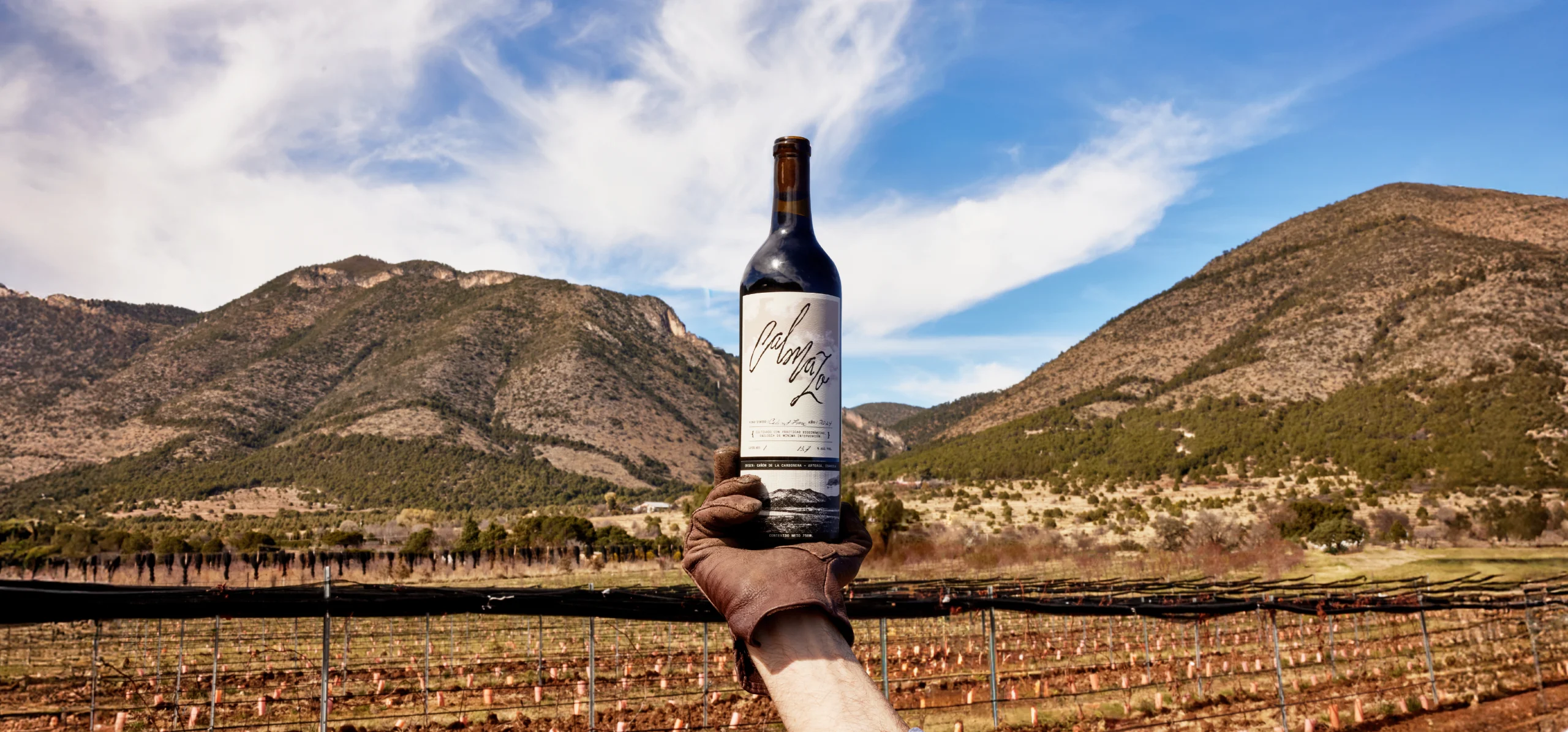
Calmazo
Clouds and wine legs in one single gesture
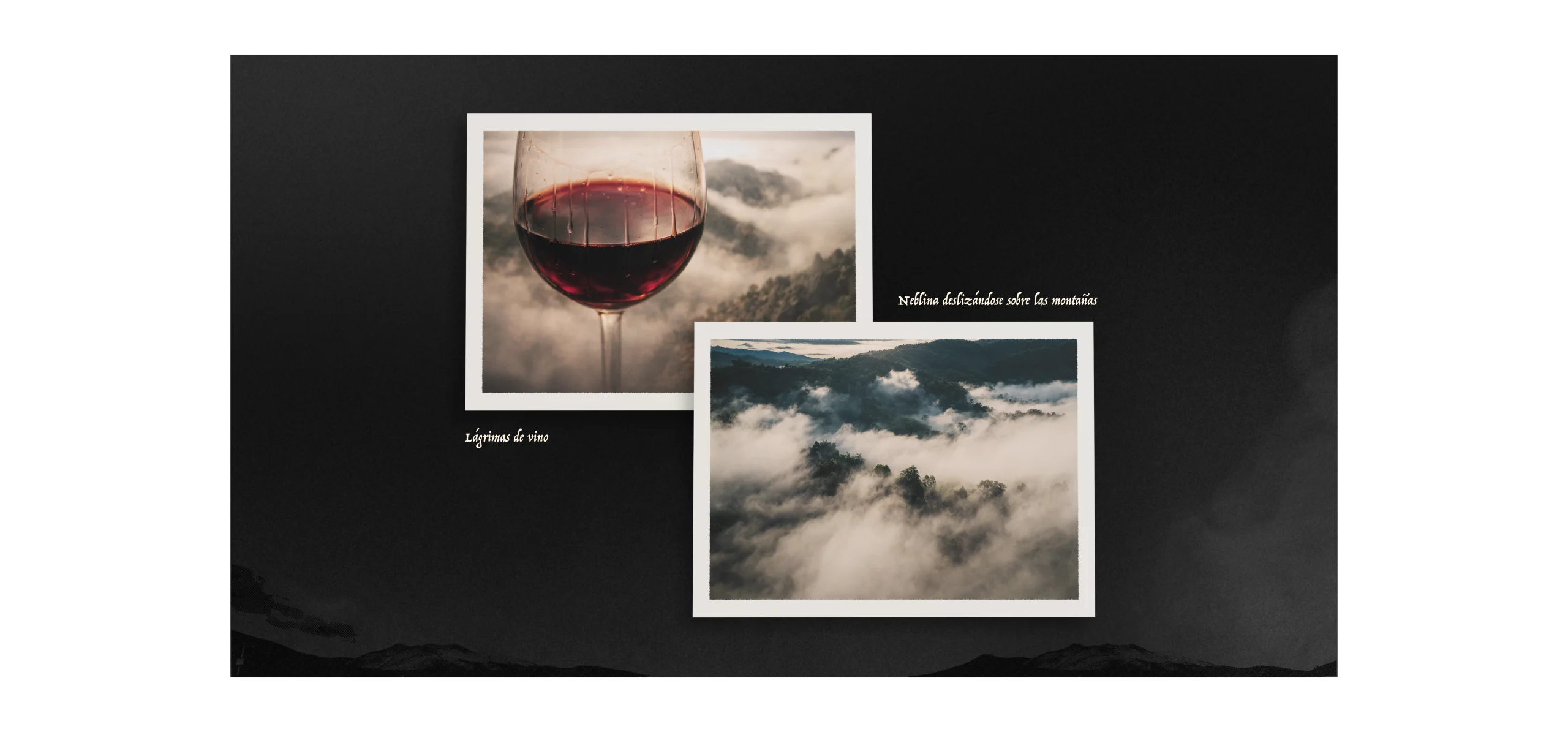
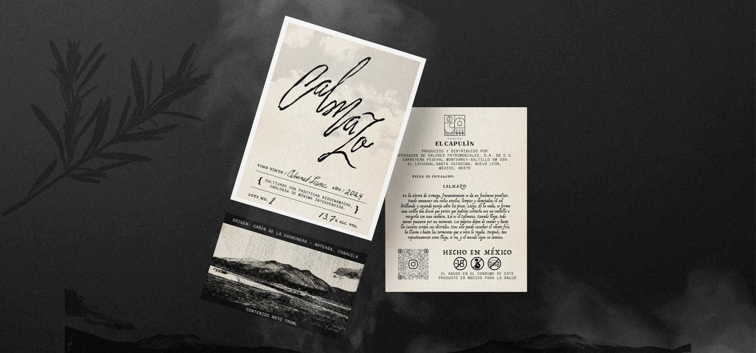
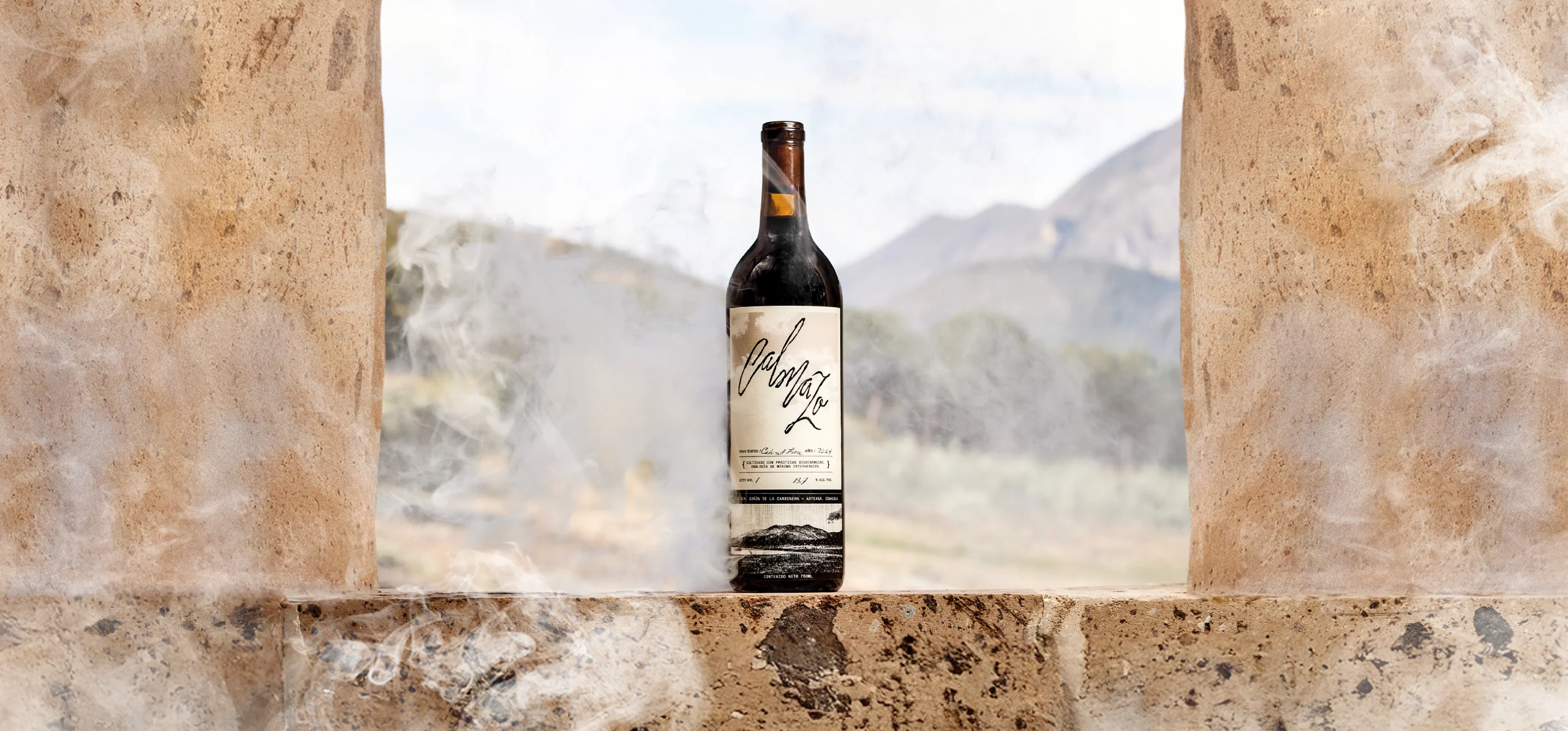
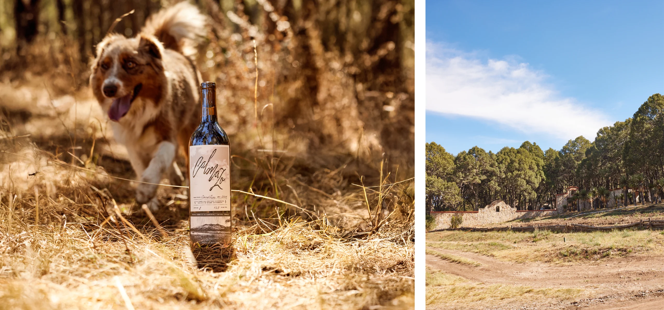
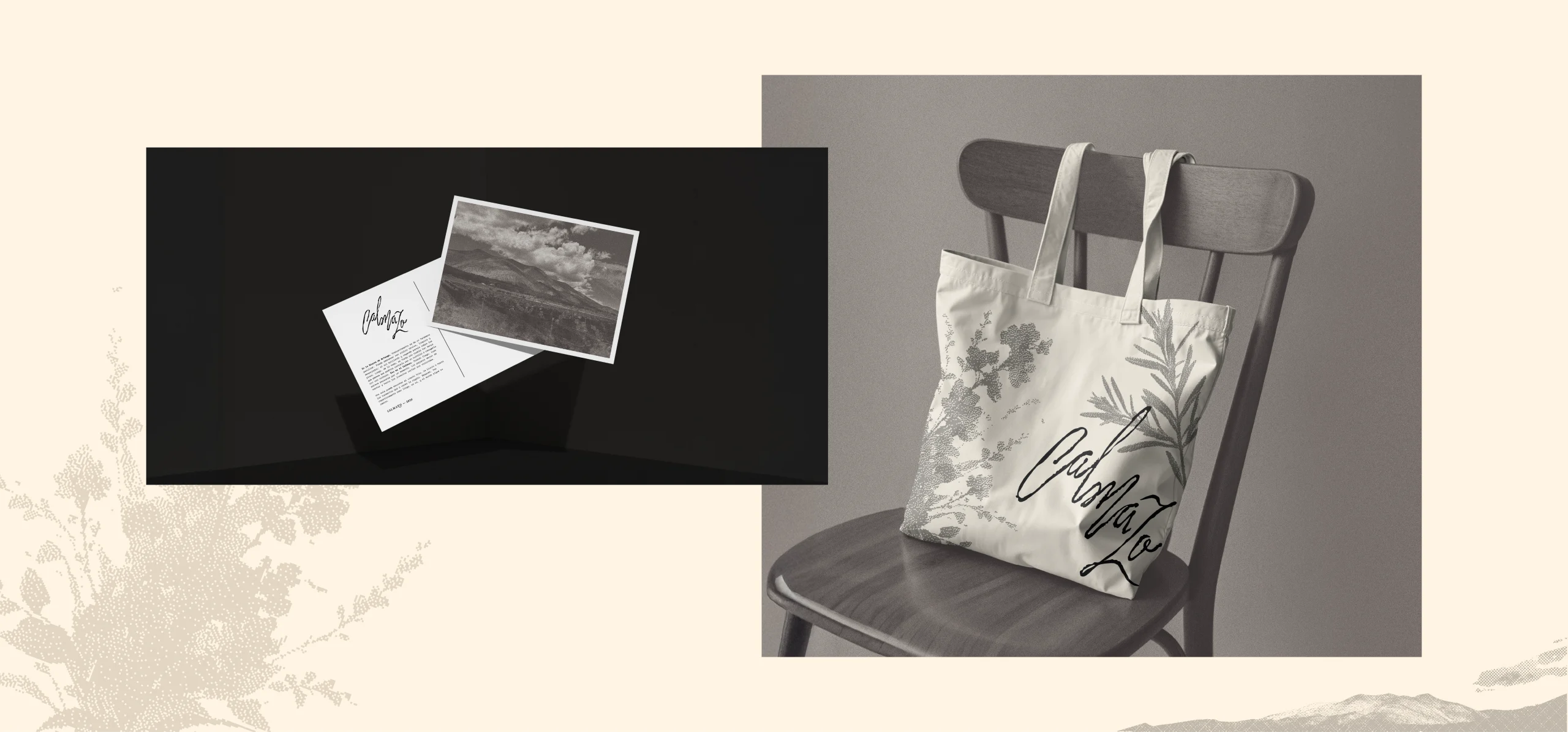
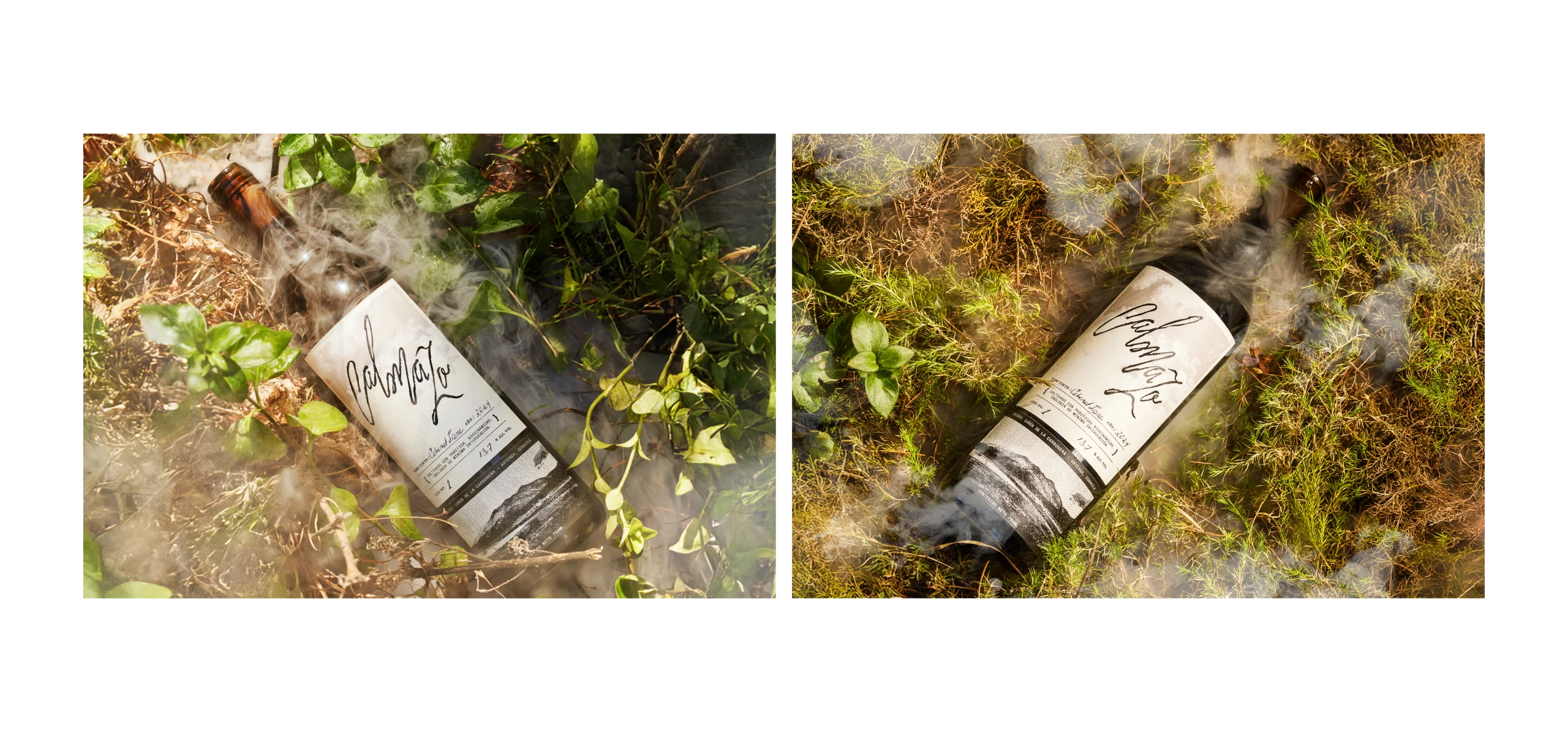
Calmazo is a line of wines produced at Rancho El Capulín, named after a natural phenomenon of the Sierra de Arteaga: a brief fog that appears and disappears. The visual identity is built around an organic logotype that evokes clouds moving over the mountains and the shape of the wine’s legs in the glass, paired with a label that integrates photography of the ranch with references to analog processes. The result is a simple label with a nostalgic character, a clear connection to its territory, and a contemporary aesthetic.
The Calmazo logotype was designed using an organic typeface with strokes that recall the movement of clouds passing between the mountains and, at the same time, the legs of the wine running down the glass.
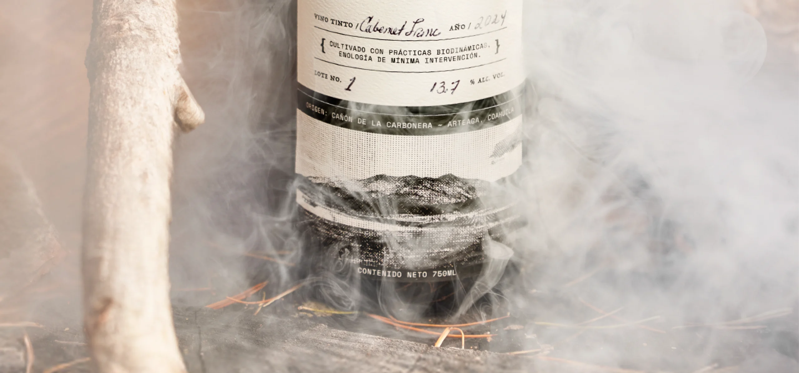
On the label, the large, black, glossy logotype appears as the main element, contrasting with the soft clouds in the background. At the bottom, a photograph of the ranch’s mountain landscape is integrated, intervened with graphic elements inspired by vintage negatives, placing the wine in the Cañón de la Cabronera, surrounded by mountains and defined by its ecosystem, which gives it that distinctive sepia tone.
The fibrous, bone-toned paper supports the idea of memory and a certain sense of nostalgia. The use of the negative and analog-inspired elements reflects the way the wine is produced: under biodynamic practices, without chemicals, and following natural cycles such as the phases of the moon and the stars.
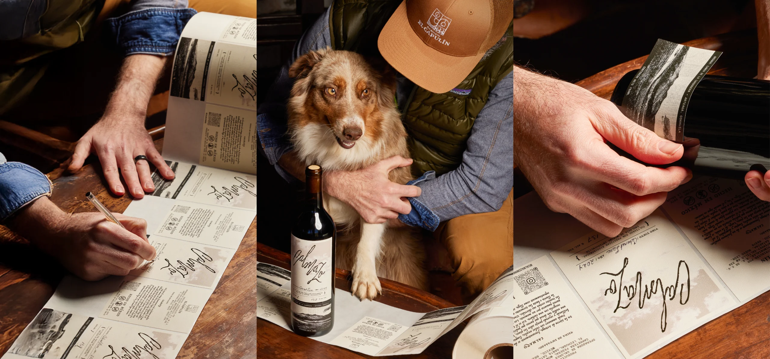
The design and graphic style of the label allow the different elements to coexist clearly and in balance with the variable information of the wine. The varietal, lot, year, and alcohol content are written by hand, facilitating adaptation to small production runs and reinforcing the handcrafted character of each bottle.
The visual identity seeks to translate an intangible phenomenon—climate, time, and pause—into a graphic system deeply rooted in its territory.


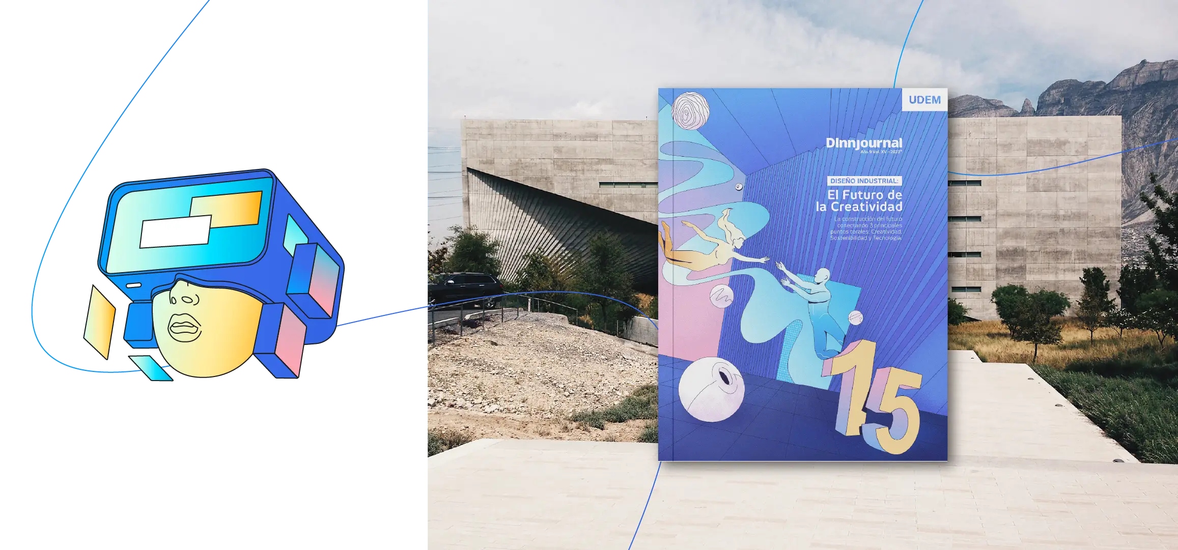
Featured Projects
Design-Led Solutions for Powerful Brand Communication
At JNZ, we believe branding is more than just visuals—it’s about building experiences, shaping narratives, and creating connections. From brand identity and packaging to editorial design, motion graphics, and internal communication, our services are crafted to bring brands to life in ways that are both striking and strategic.
01
Logos, visual systems, and branding collaterals that define who you are.
02
Packaging and menu designs that enhance how your brand is experienced.
03
Books, magazines, and corporate publications that tell powerful stories.
04
Custom artwork that adds personality and distinction to your brand.
05
Animated content that engages audiences and brings brands to life.
06
Strategies and materials that align teams and reinforce corporate culture.
07
Strategic packaging design that makes brands look premium and memorable.
Trusted by startups, creatives, and suits alike


Clear communication builds strong culture. With JNZ, your internal touchpoints become branded experiences that reinforce trust, direction, and identity. Our designs help reduce noise, improve engagement, and unify messaging—so your teams stay informed, aligned, and inspired.
Whether it’s onboarding new hires, communicating change, or reporting progress, we help you design it with intention.