Calmazo

Clouds and wine legs in one single gesture

Services:

Brand Identity

Logo Design

Collaterals

menu design

Industry:

Food & Bevarage

Location:

San Pedro garza garcía

Mexico

Calmazo is a line of wines produced at Rancho El Capulín, named after a natural phenomenon of the Sierra de Arteaga: a brief fog that appears and disappears. The visual identity is built around an organic logotype that evokes clouds moving over the mountains and the shape of the wine’s legs in the glass, paired with a label that integrates photography of the ranch with references to analog processes. The result is a simple label with a nostalgic character, a clear connection to its territory, and a contemporary aesthetic.

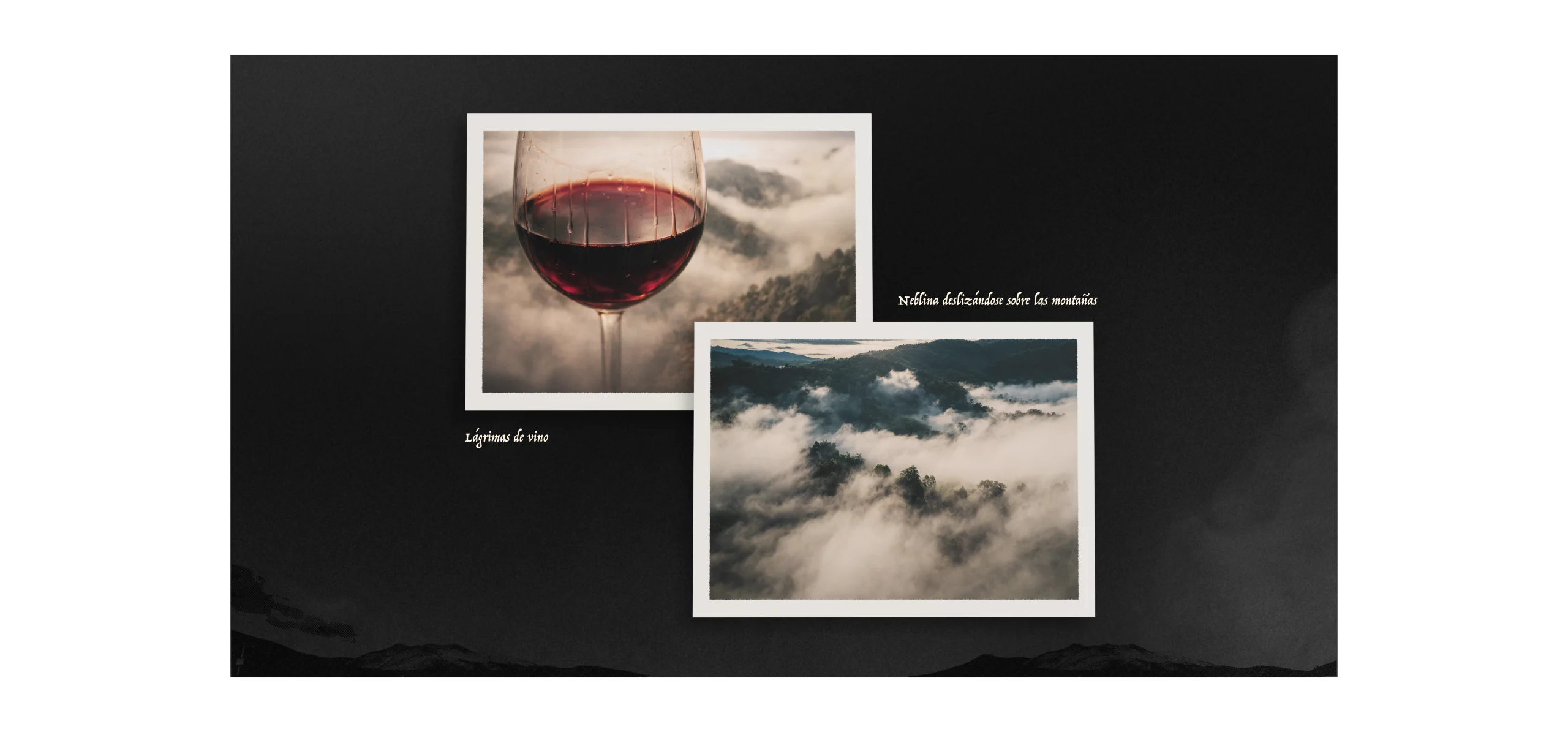
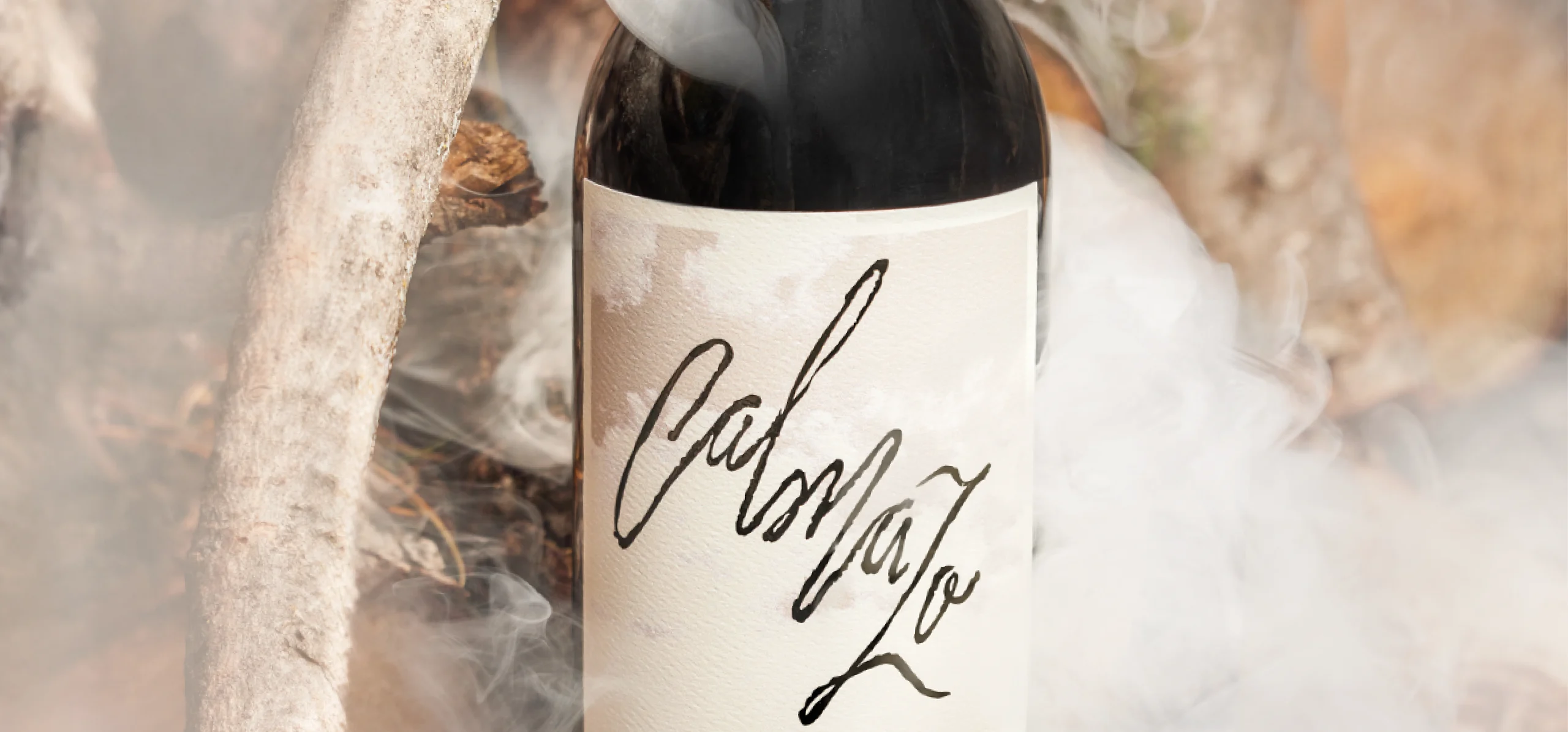
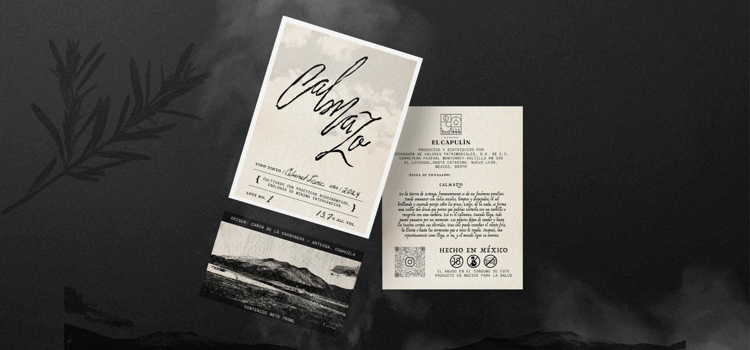
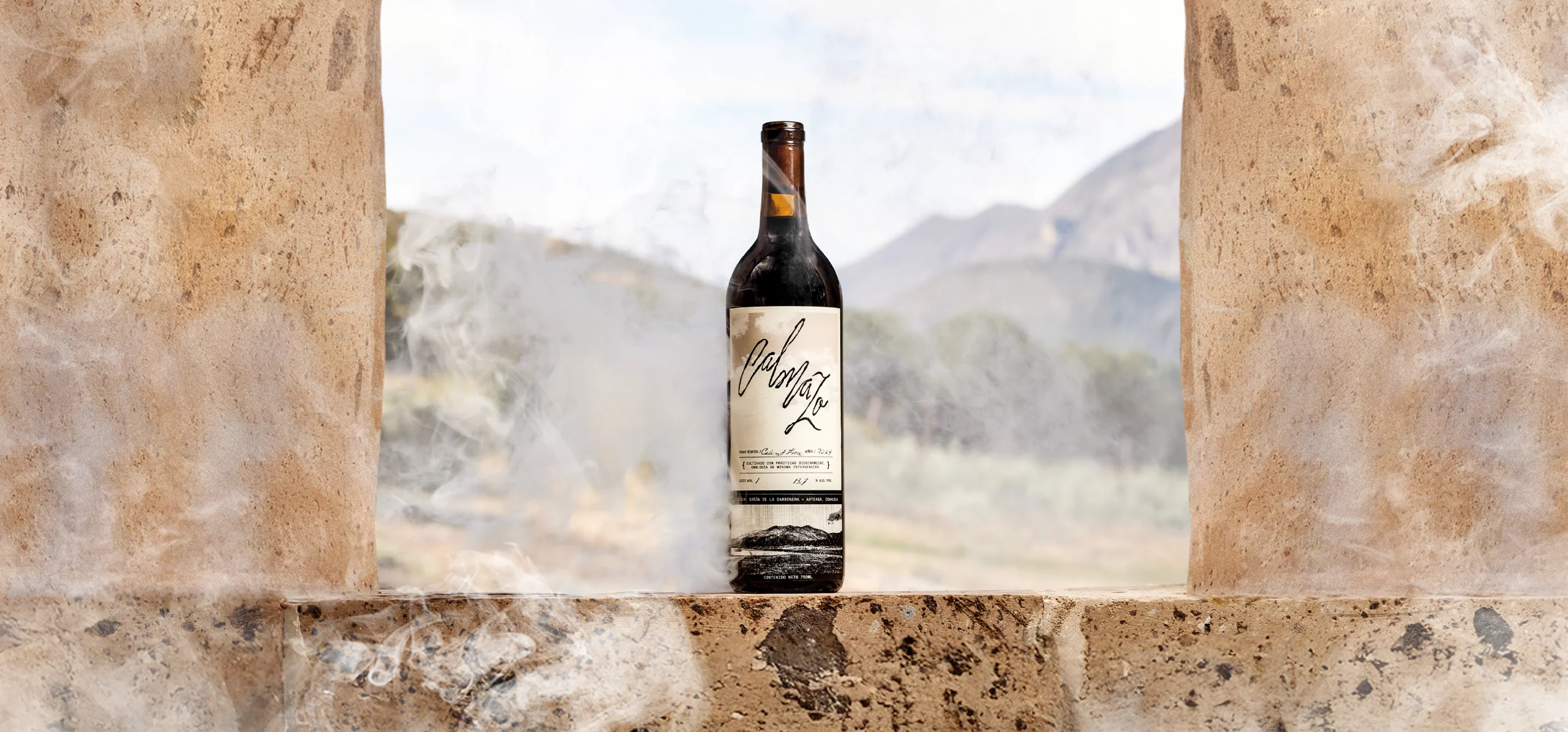
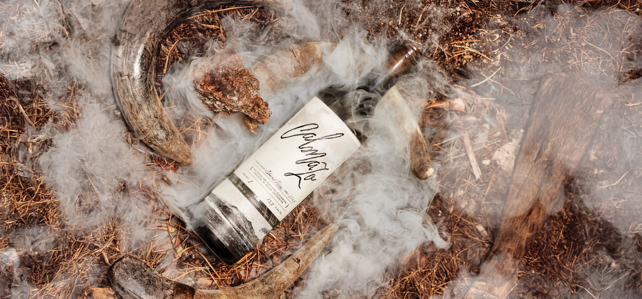
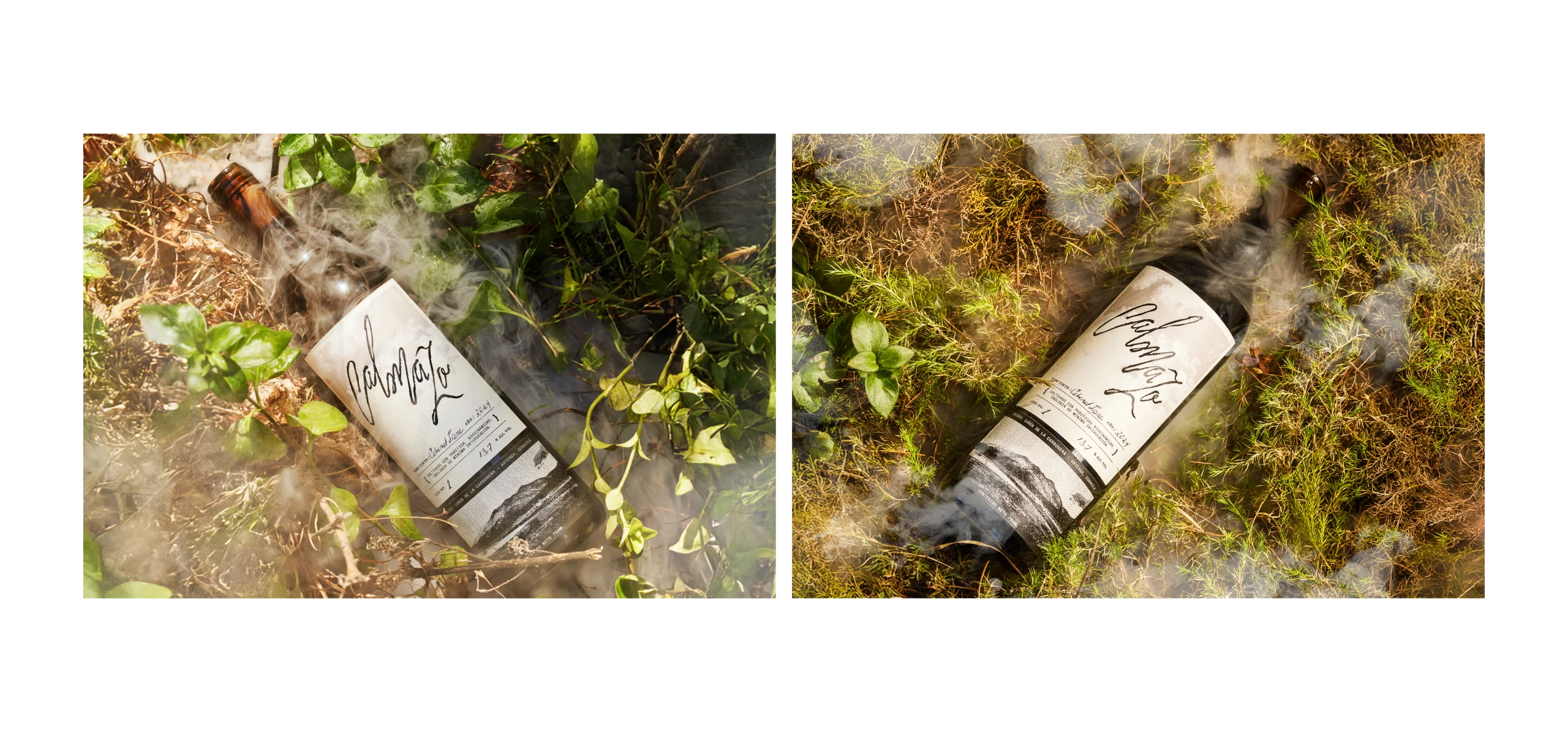
The Calmazo logotype was designed using an organic typeface with strokes that recall the movement of clouds passing between the mountains and, at the same time, the legs of the wine running down the glass.

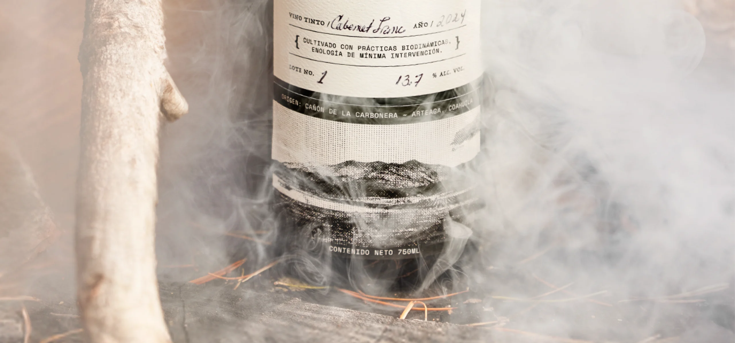
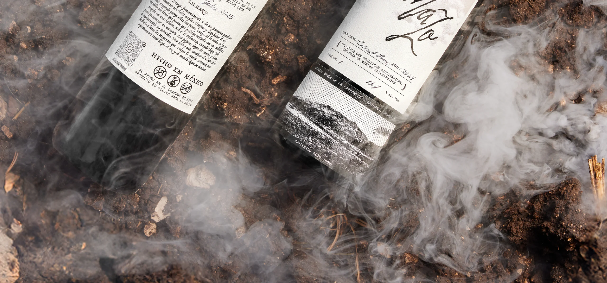
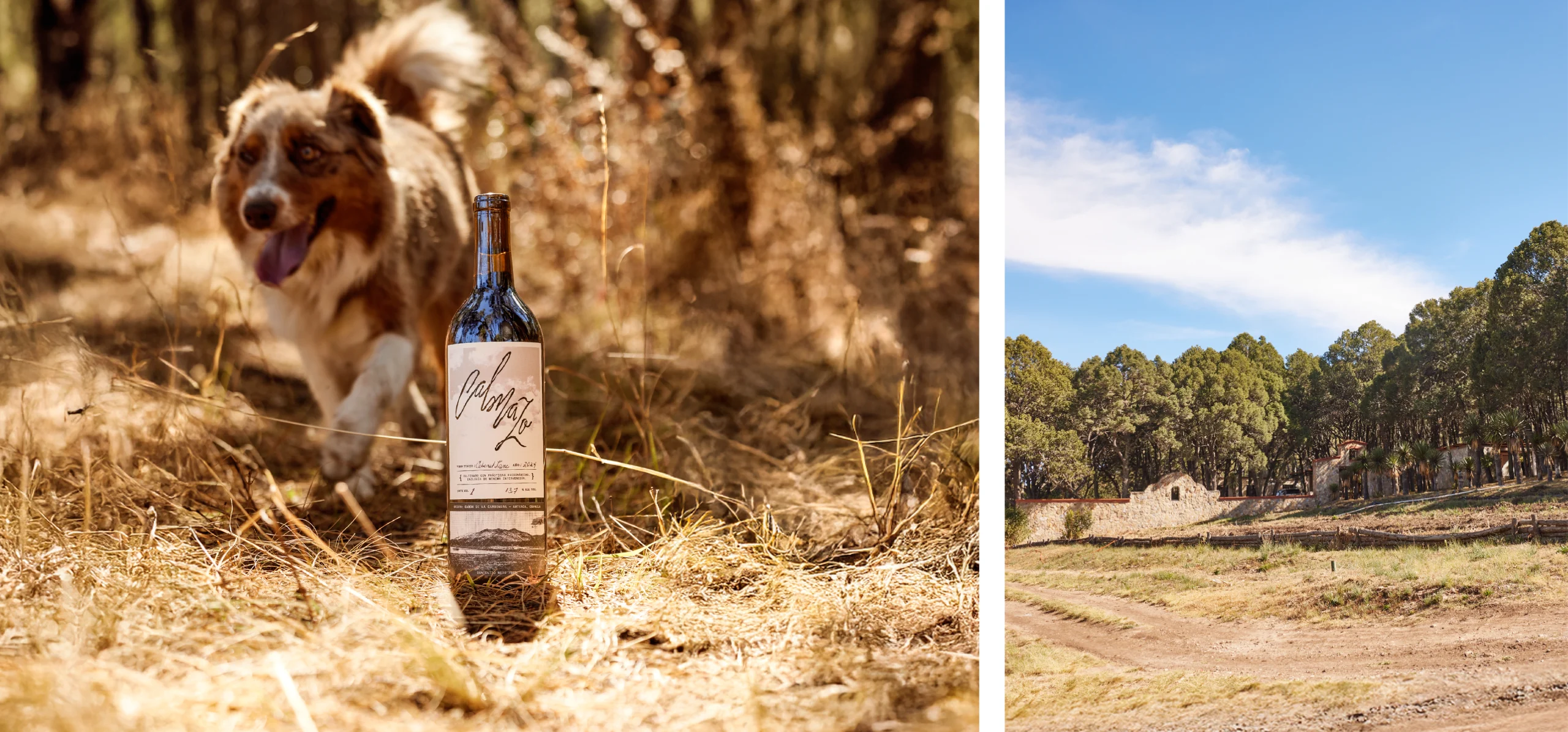
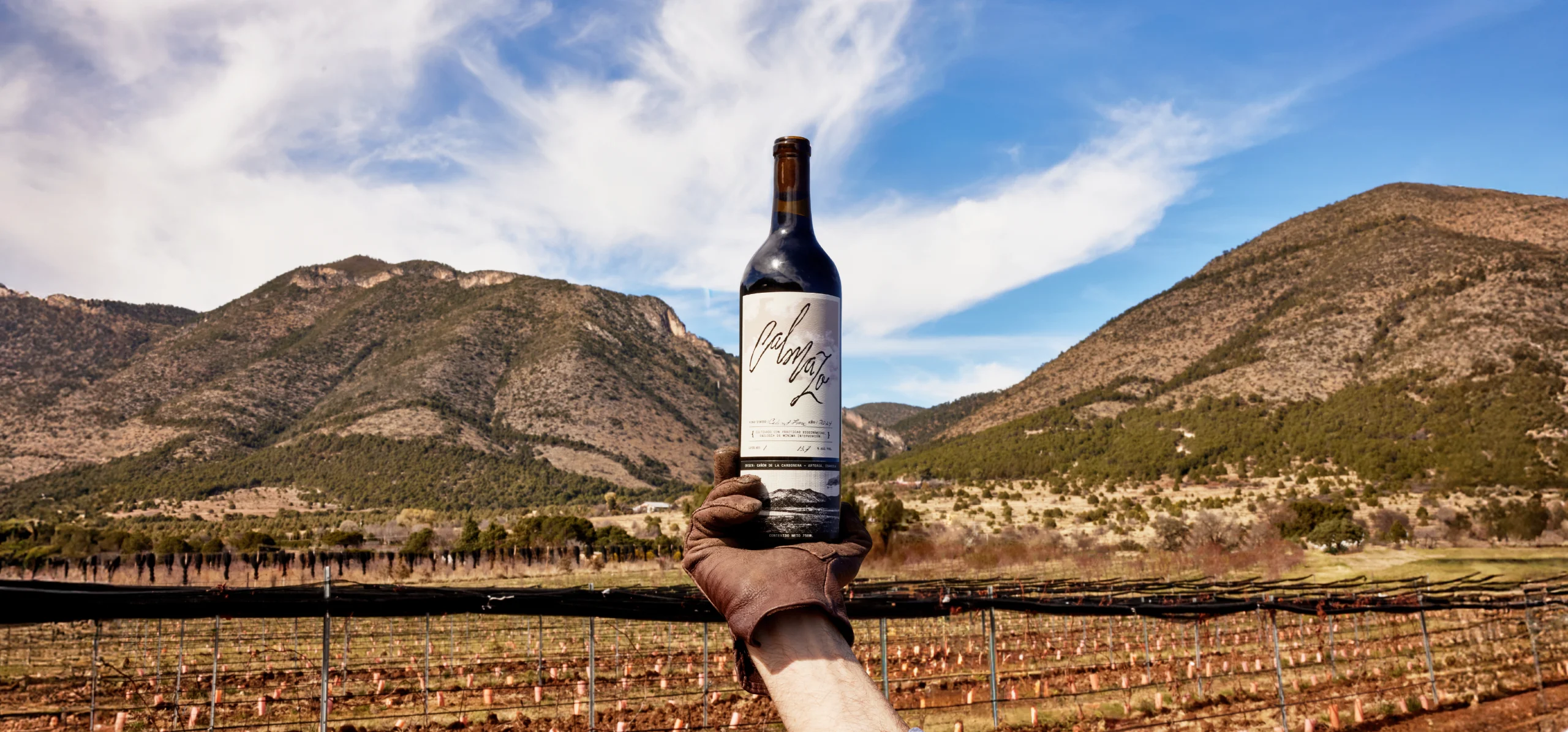
On the label, the large, black, glossy logotype appears as the main element, contrasting with the soft clouds in the background. At the bottom, a photograph of the ranch’s mountain landscape is integrated, intervened with graphic elements inspired by vintage negatives, placing the wine in the Cañón de la Cabronera, surrounded by mountains and defined by its ecosystem, which gives it that distinctive sepia tone. 

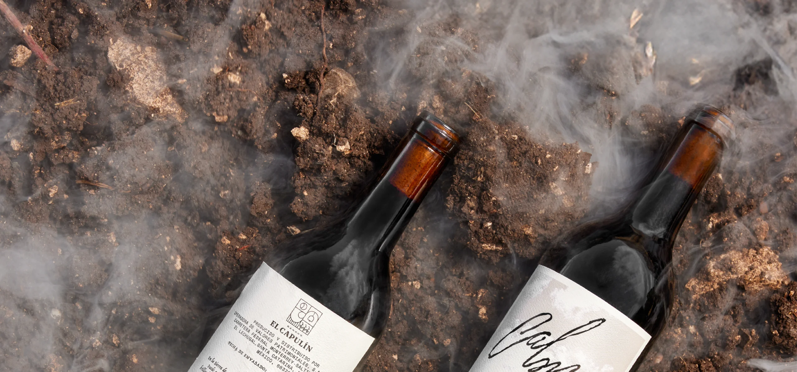
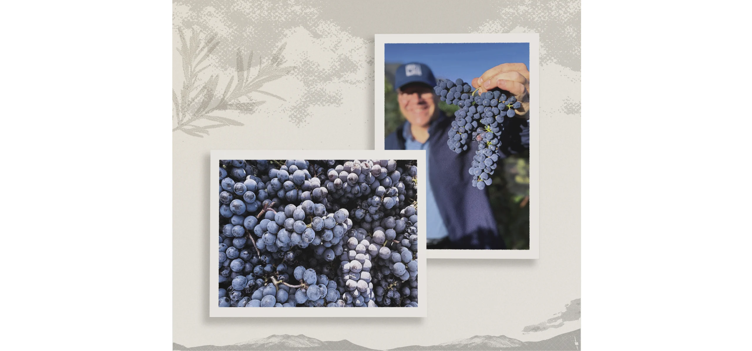
The fibrous, bone-toned paper supports the idea of memory and a certain sense of nostalgia. The use of the negative and analog-inspired elements reflects the way the wine is produced: under biodynamic practices, without chemicals, and following natural cycles such as the phases of the moon and the stars.


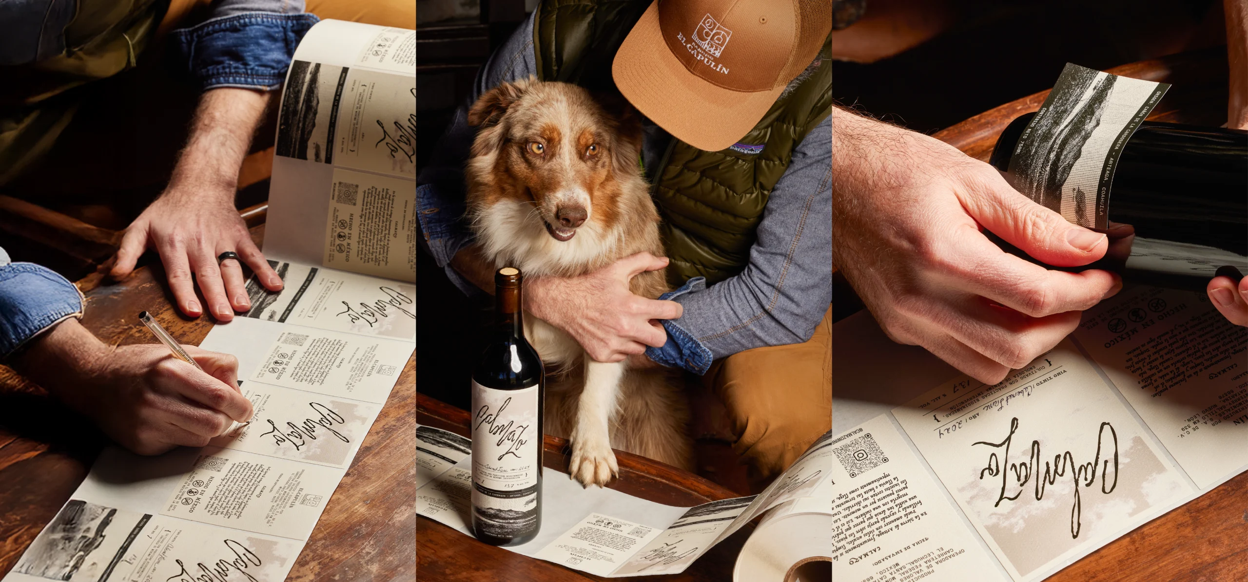
The design and graphic style of the label allow the different elements to coexist clearly and in balance with the variable information of the wine. The varietal, lot, year, and alcohol content are written by hand, facilitating adaptation to small production runs and reinforcing the handcrafted character of each bottle.

The visual identity seeks to translate an intangible phenomenon—climate, time, and pause—into a graphic system deeply rooted in its territory. 

Our Work

Featured Projects

A Branding Agency Focused on Global Impact

Jerome & Zimmerman is an international branding agency that partners with forward-thinking businesses to craft bold, unforgettable brand identities. Through a combination of strategic insight, creative vision, and meticulous execution, we transform businesses into brands that resonate deeply with their audiences, leaving a lasting impact in a crowded marketplace. 

Trusted by startups, creatives, and suits alike

Testimonials

A word from our clients,

BrandMode's innovative approach revitalized our online presence, driving remarkable growth, outstanding!

Daniel Clark HealthPlus

Thanks to Brandmode, our social media engagement soared and our brand visibility improved tremendously.

Jessica Lee StyleFusion

Brandmode’s SEO and content marketing expertise boosted our search rankings and organic traffic noticeably

Michael Thompson GreenGrocer